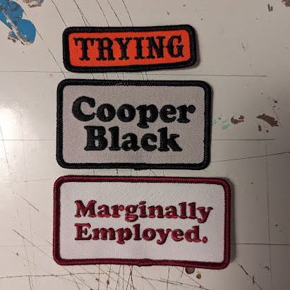
A Patch Three Pack
$20
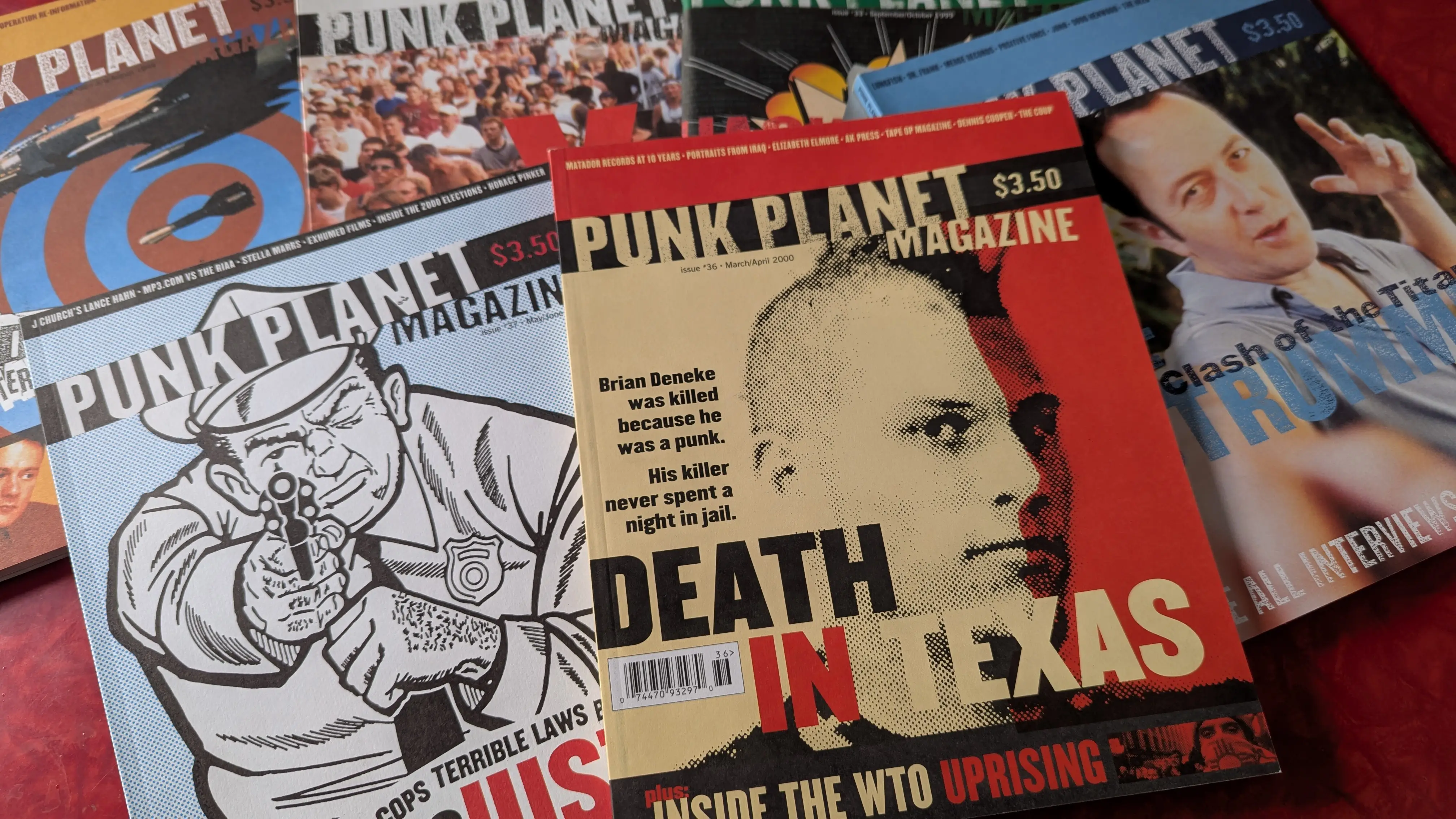
Punk Planet Year Six, issues 32-37.
2024 marked 30 years since the start of Punk Planet, the magazine I ran for 13 years. To commemorate that milestone, I wrote 13 posts over 13 months, each one about a single year of the magazine. A year of learning, a year of trying, a year of making something impossible possible.
Read: Year One | Year Two | Year Three | Year Four | Year Five | Year Six | Year Seven | Year Eight | Year Nine | Year Ten | Year Eleven | Year Twelve | Year Thirteen
I'm not sure if there's a year that better exemplifies how much Punk Planet had found its stride than Year Six. The articles were legit great (PP36's "Death in Texas" is one of the best articles we ever ran), our columnists were popular, the record review sections were enormous, even little features like the DIY Files, which offered instructions on everything from laying floor tile to self-defense, had expanded into a mini-section with regular entries on DIY Audio, DIY Health, DIY Business, and DIY Sex. Punk Planet had become 150 extremely confident pages served up every-other month. And it only took six years.
There was one huge change in Year Six that completely transformed the magazine. As I mentioned in the endnotes of the essay on Year Five, at the very end of that year, we adopted a consistent headline typeface, Knockout (from what was then the Hoefler & Frere-Jones type foundry), and standardized the look and feel of the magazine much more than we ever had before. That work was done in part for a change that would happen right away in Year Six: the departure of Josh Hooten who had played an integral role in the graphic language of the magazine since issue nine. Having standardized the design of the magazine ahead of this meant that bringing new people in to help design was much more straightforward.
That said, the design language we adopted was anything but "standard," allowing designers quite a bit of free reign over type treatment, art, and layout. But there were rules: reaching back to punk's cut-and-paste zine roots, we put an emphasis on hand-manipulated, xerox smeared type. But, you know, classy.
Three people would come in to fill Josh's shoes: Dustin Mertz, Marianna Levant, and Frol Boundin (they would be joined the following year by Mike Coleman and later still by Jon Krohn). They jumped right into the new design language we'd established and pushed it so much further than I could possibly have imagined. Everyone would assemble at the Punk Planet office (a tiny space on Ravenswood in Chicago) on our final production weekend. We'd pin our layouts up on a big bulletin board and critique them. We'd learn from each other. We'd push each other. Looking back at the whole of the Year Six run, it is clear this new crew brought a shot of adrenaline into the magazine that I didn't know it needed.
I thought that maybe the best way to mark the sixth year of Punk Planet was not with a lengthy essay but by making a gallery of some of the most exquisite spreads from this year. There were so many bangers that I couldn't even include them all.
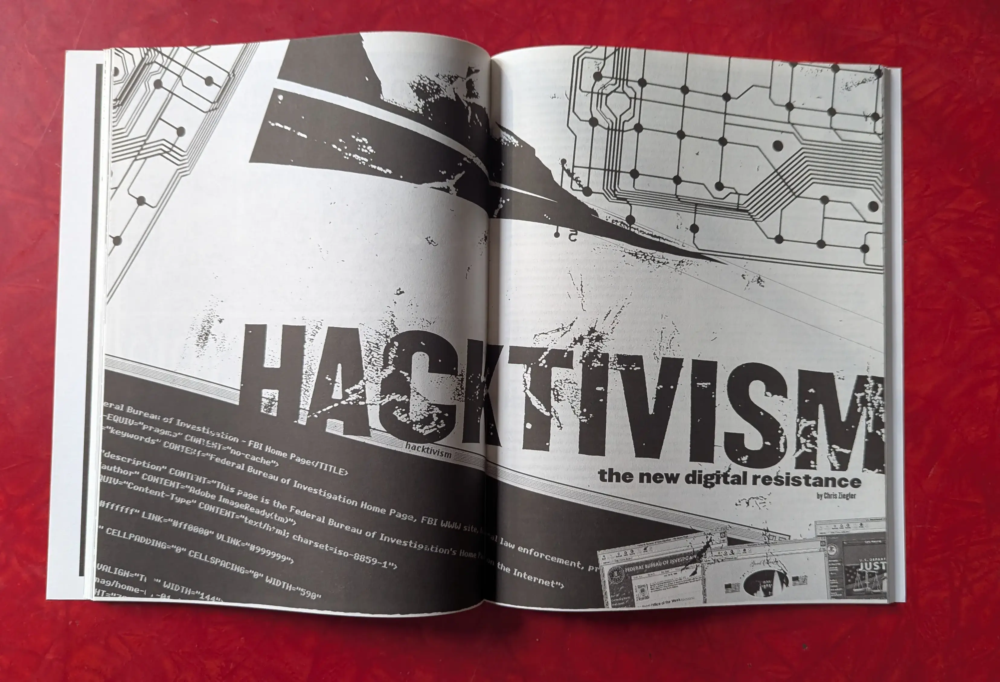
PP33's cover story on hacker-activists got a beautiful full-spread opener.
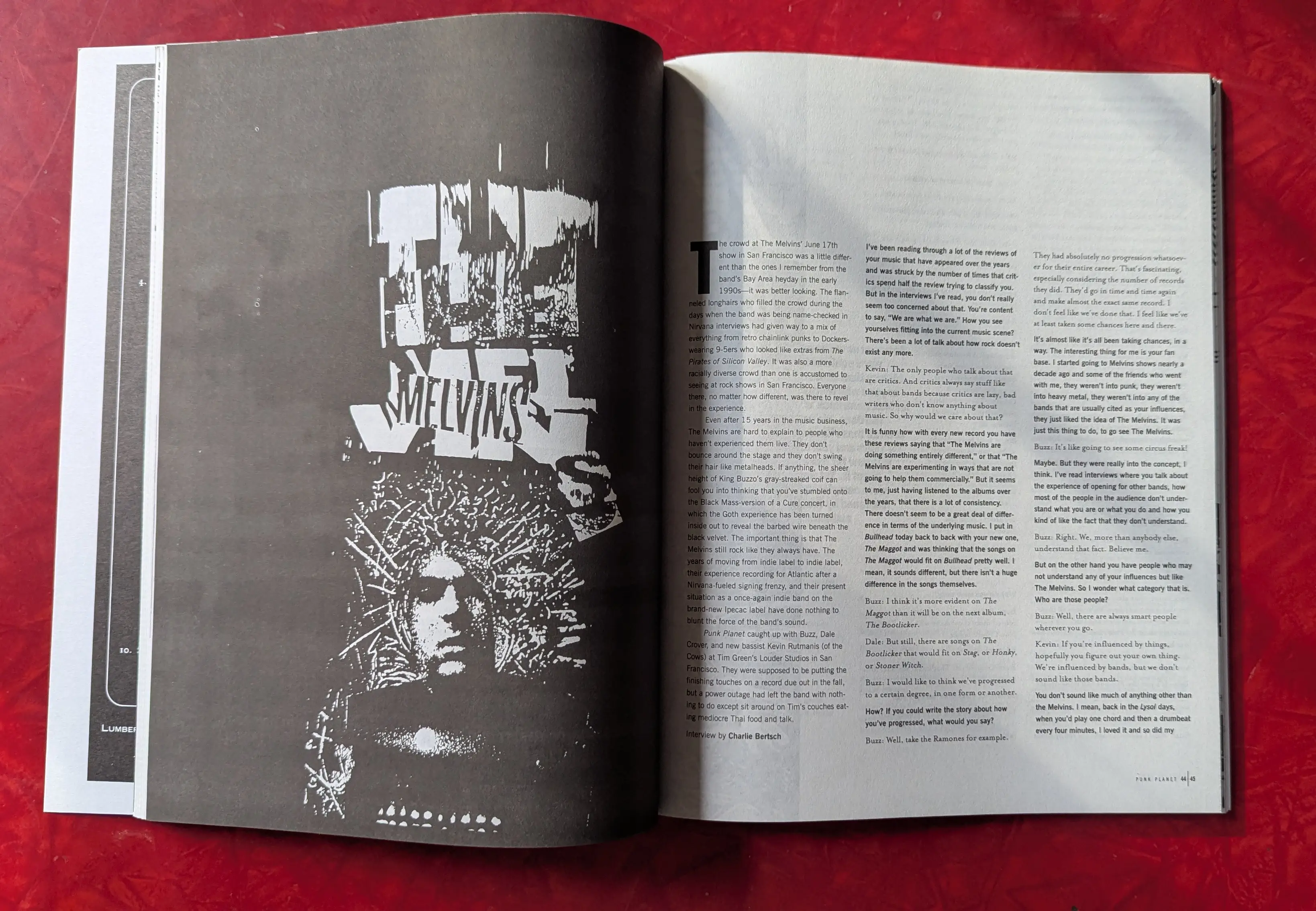
The hand-crafted type and image for this Melvins interview (PP33) is mind-blowing.
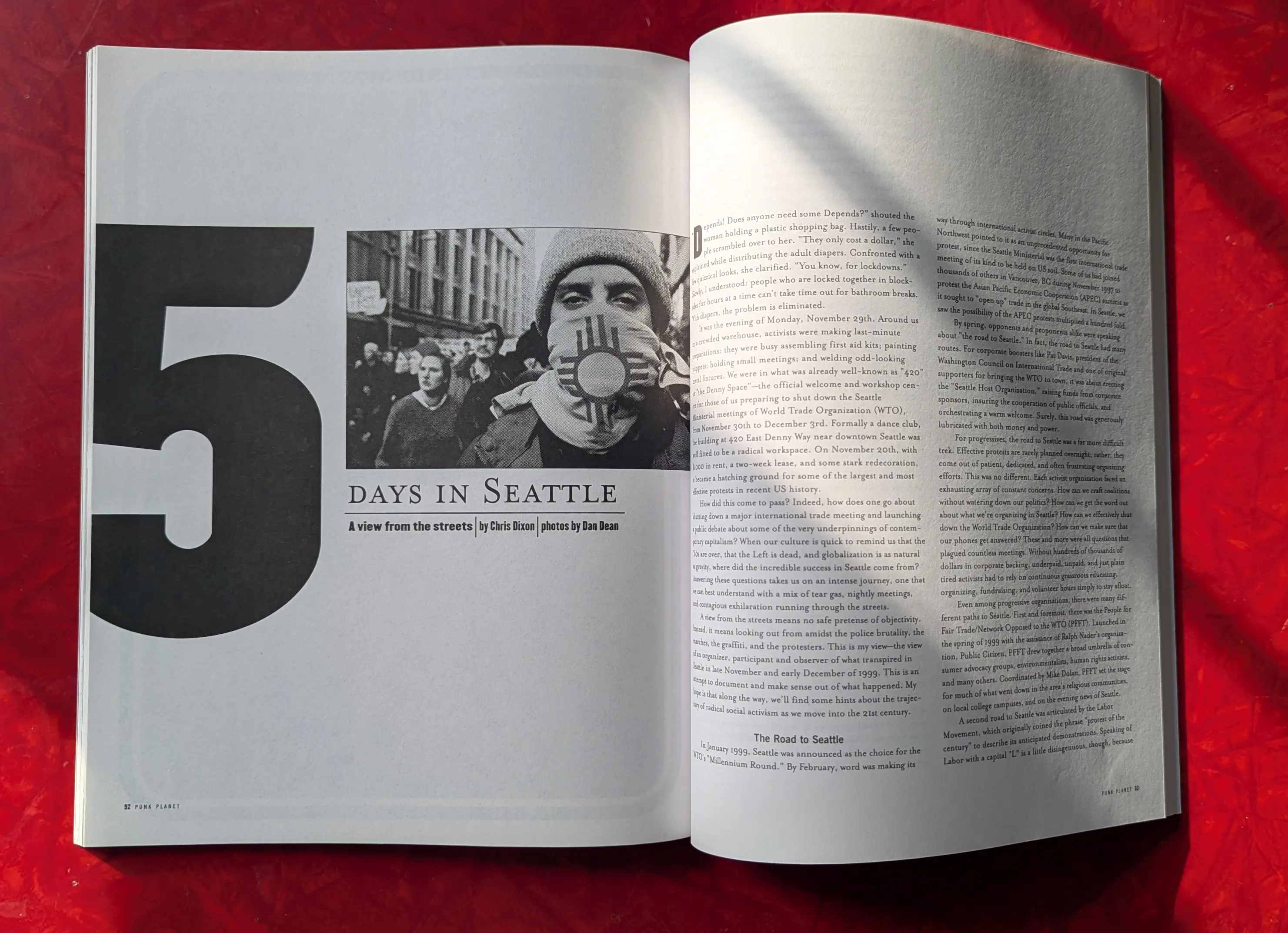
While so much of what we did was highly-distressed, the stark approach for this first-hand diary from the WTO Protests in Seattle (PP36) is stunning.
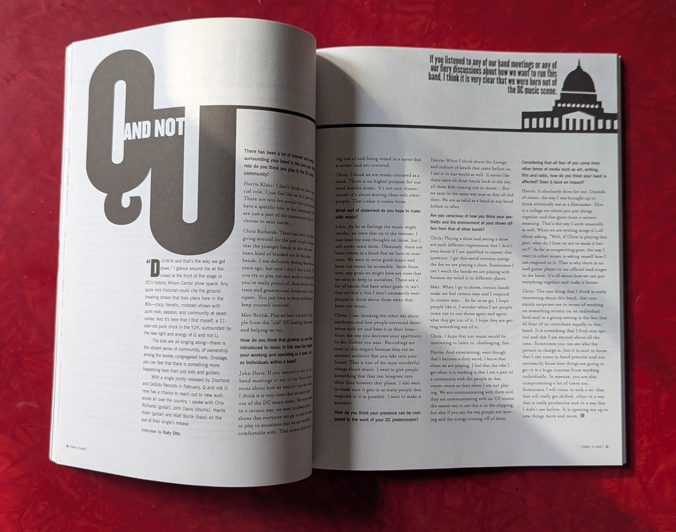
Another clean approach, for DC band Q & Not U (PP37). I actually got an email from either Hoefler or Frere-Jones complimenting us on the use of Knockout's Q on this one.
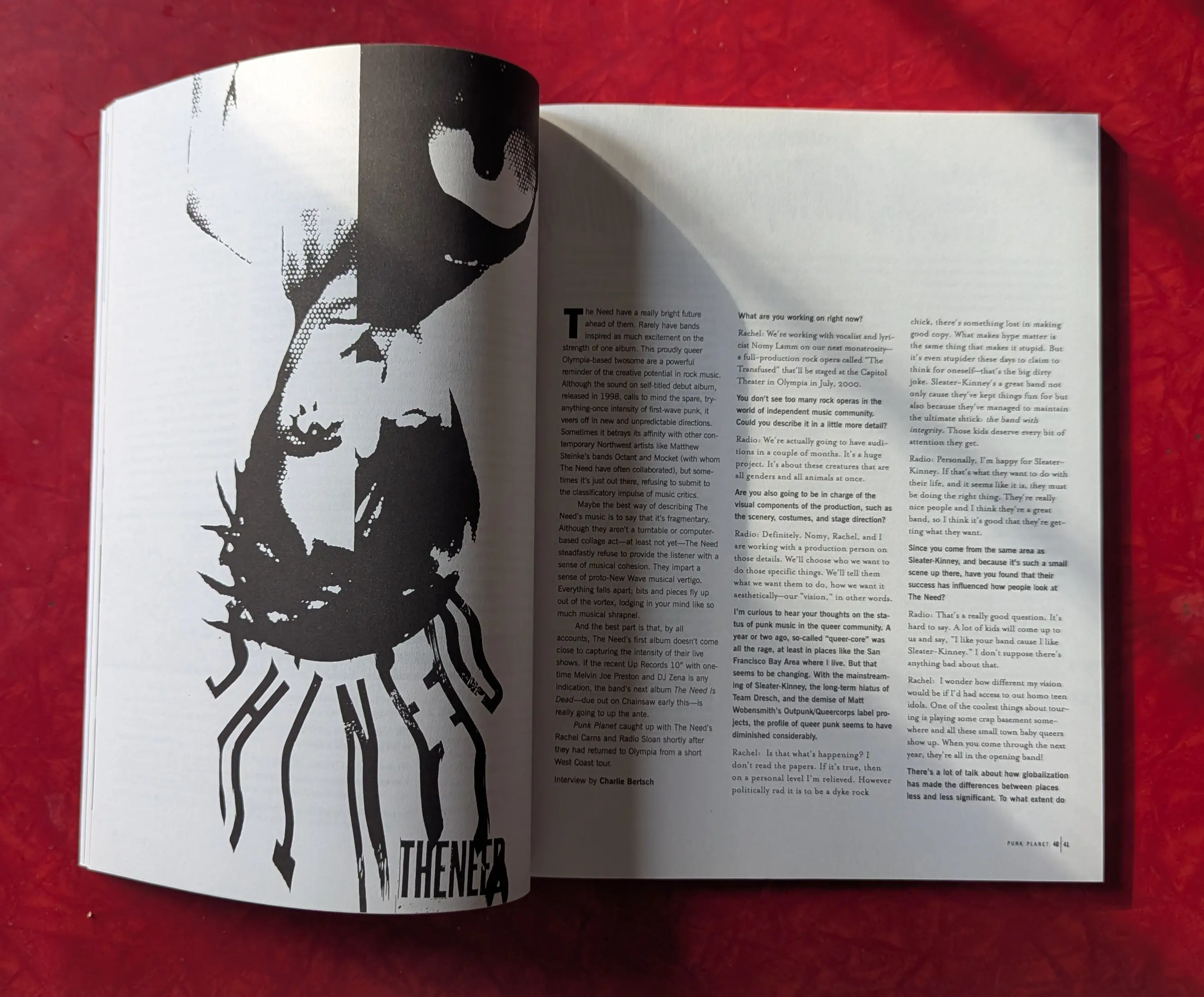
I love how playful and disorienting the collage is on this opener for an interview with The Need (PP35). In processing this image, I kept rotating it wrong.
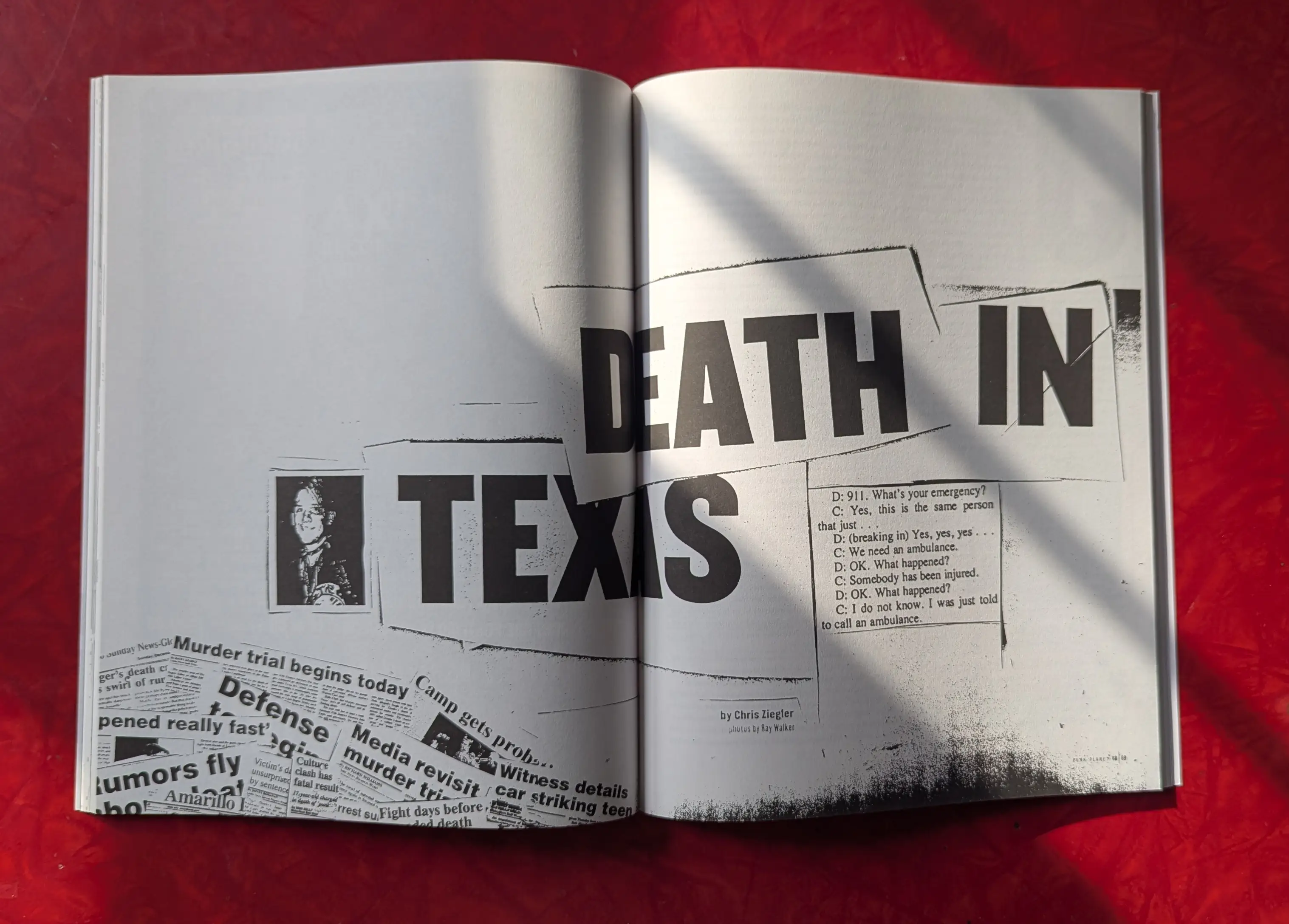
This layout focuses on the 911 call that's at the center of the murder in PP36's cover story Death in Texas.
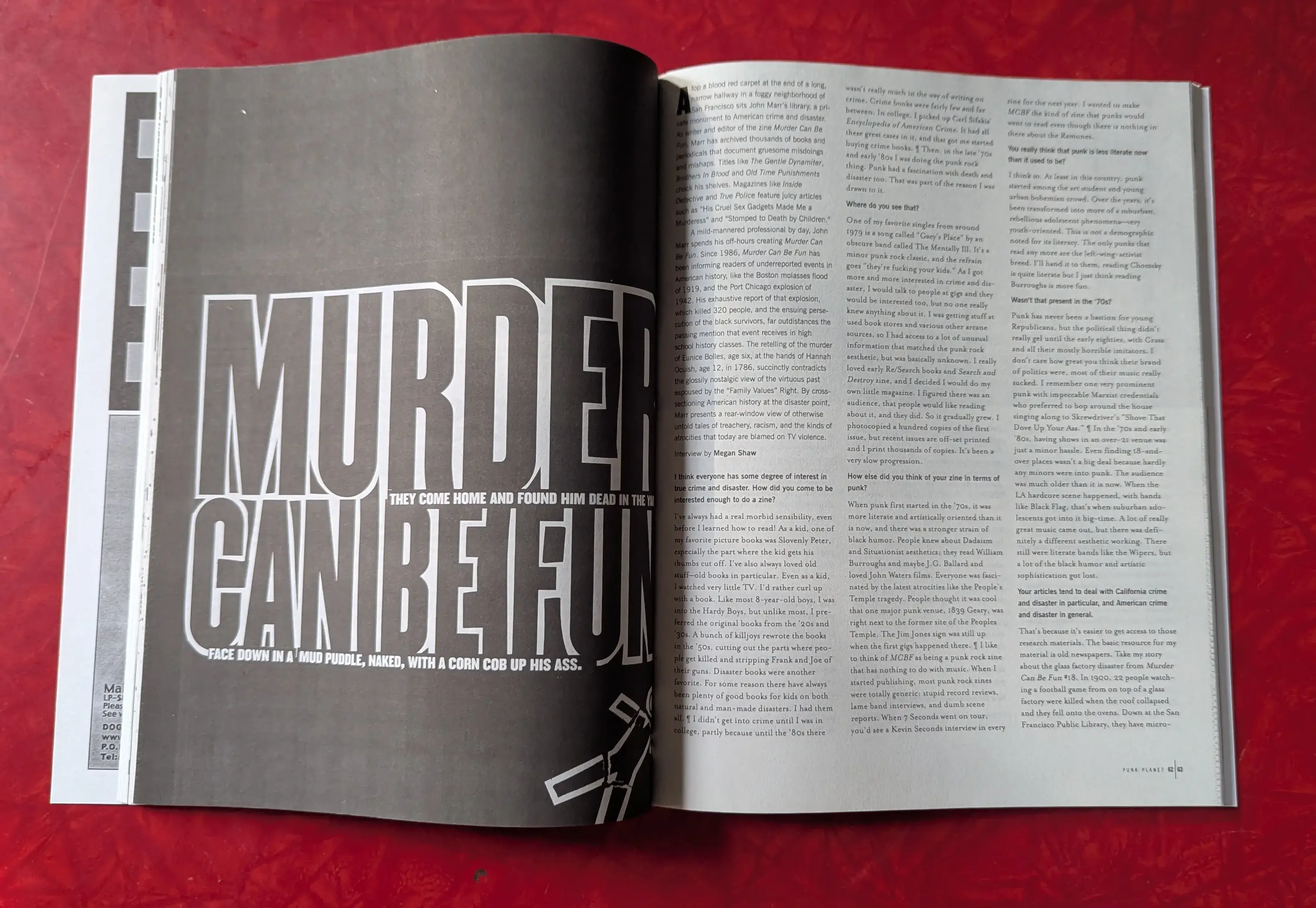
We upgraded our paper which allowed for much darker layouts, like this one for the true-crime zine Murder Can Be Fun (PP32). Previously, spreads like this would have come off on your hands.
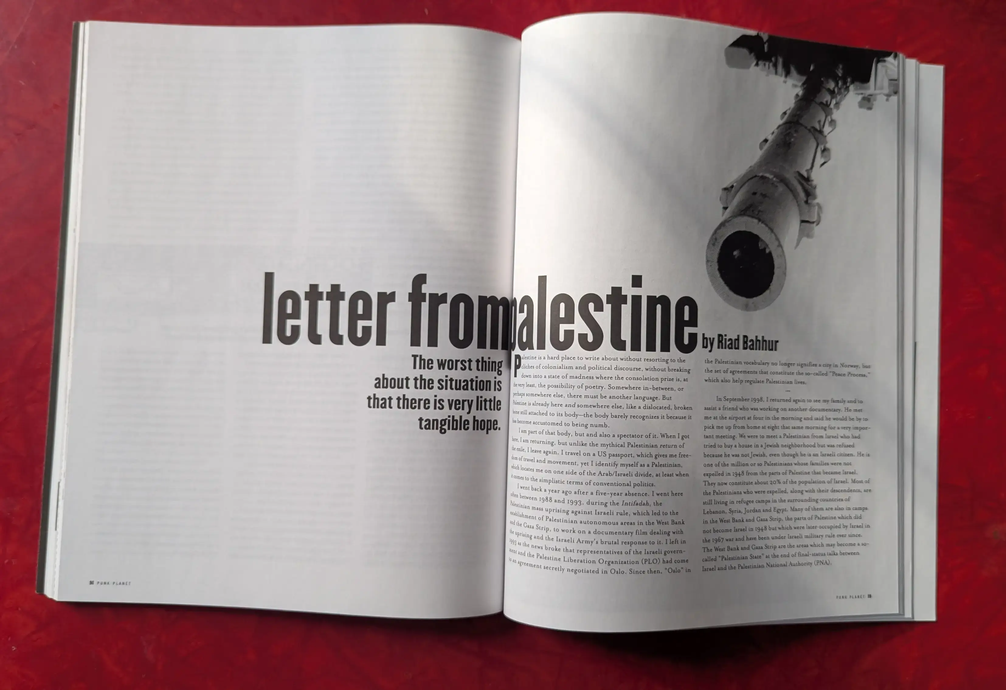
Empty space creates tension in this far-too-relevant-today letter from a Palestinian in PP34.
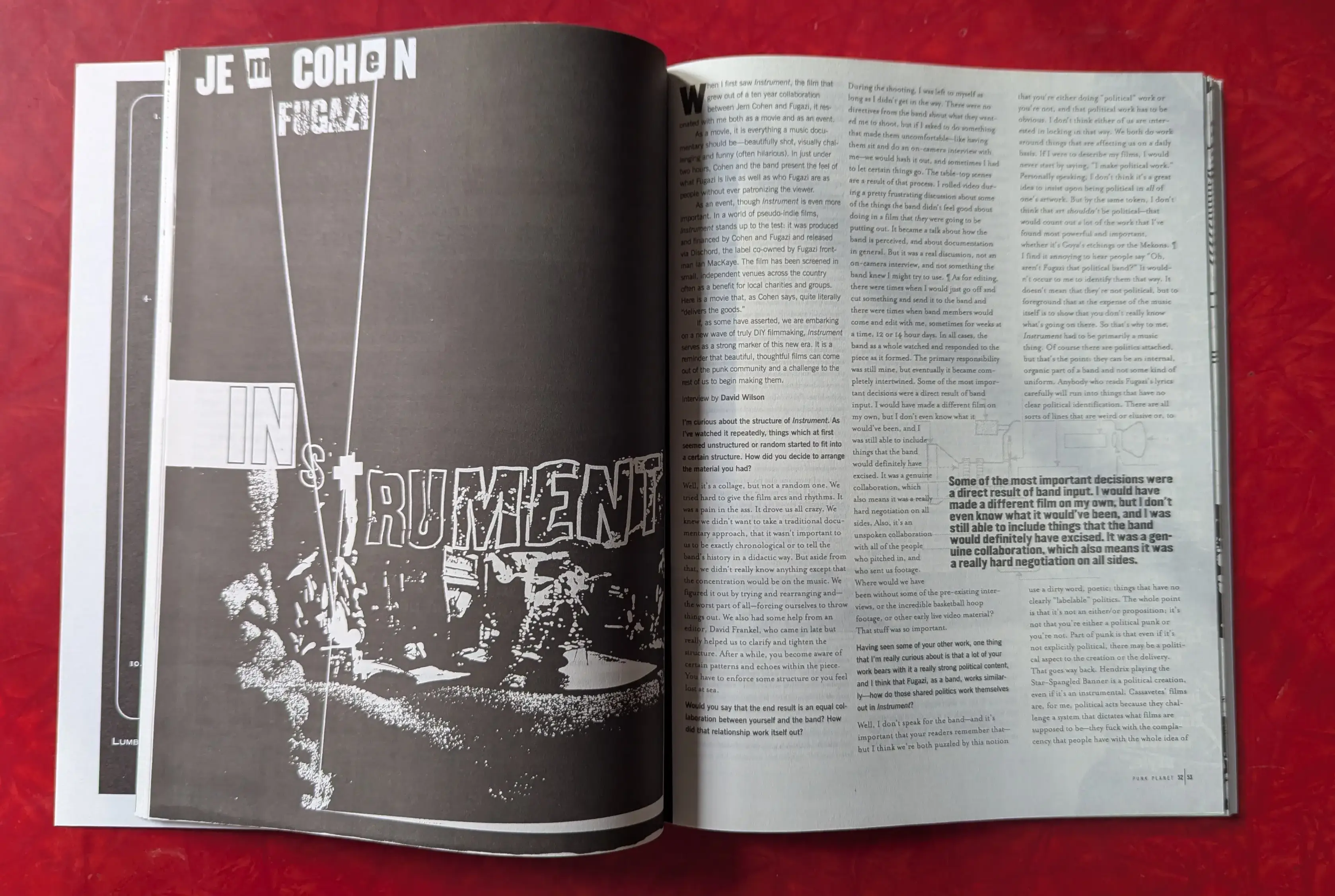
I love how batshit this lockup is for an interview with filmmaker Jem Cohen about his collaboration with Fugazi, Instrument (PP33).
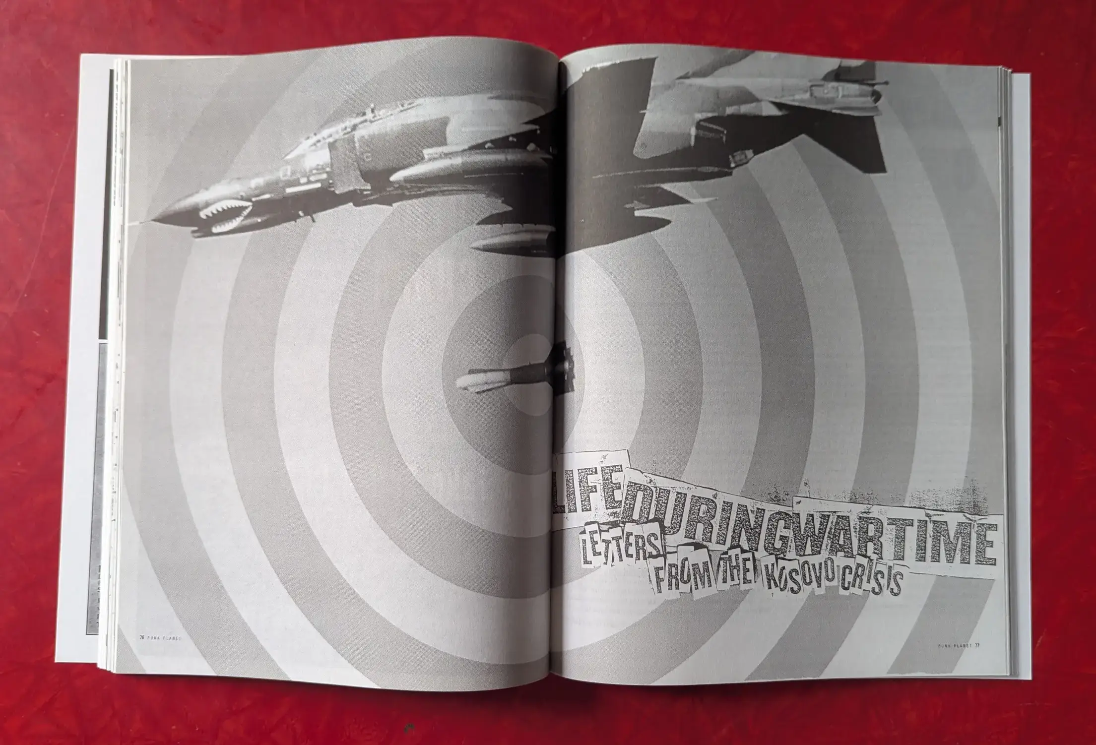
By the end of a production weekend, our floor would be covered with chopped up letters, like for this opening spread from PP32.
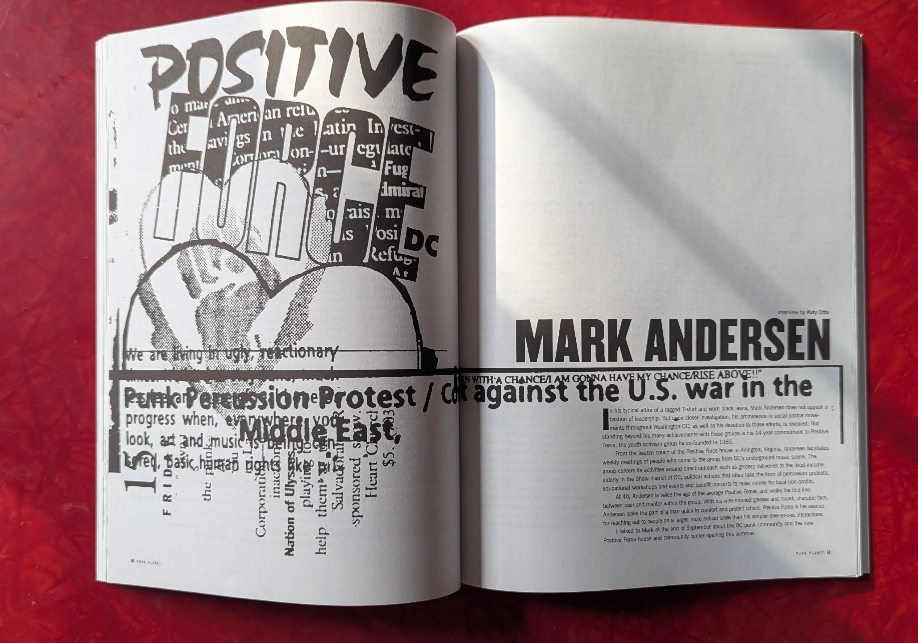
This team was very, very good at making collages that grabbed attention, like this one for longtime DC organizer Mark Andersen (PP35).
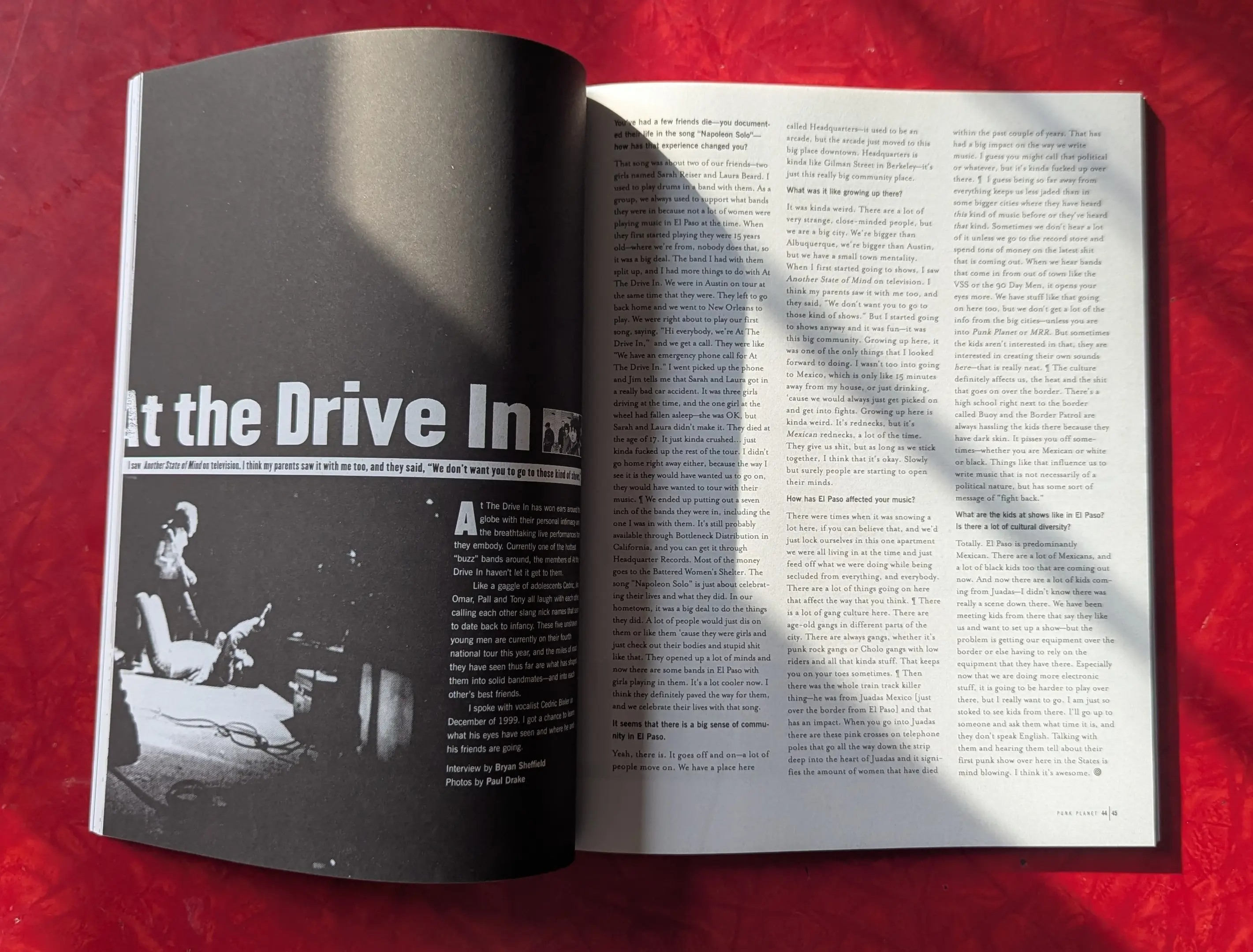
A really elegant approach for an interview with At The Drive-In (PP36).
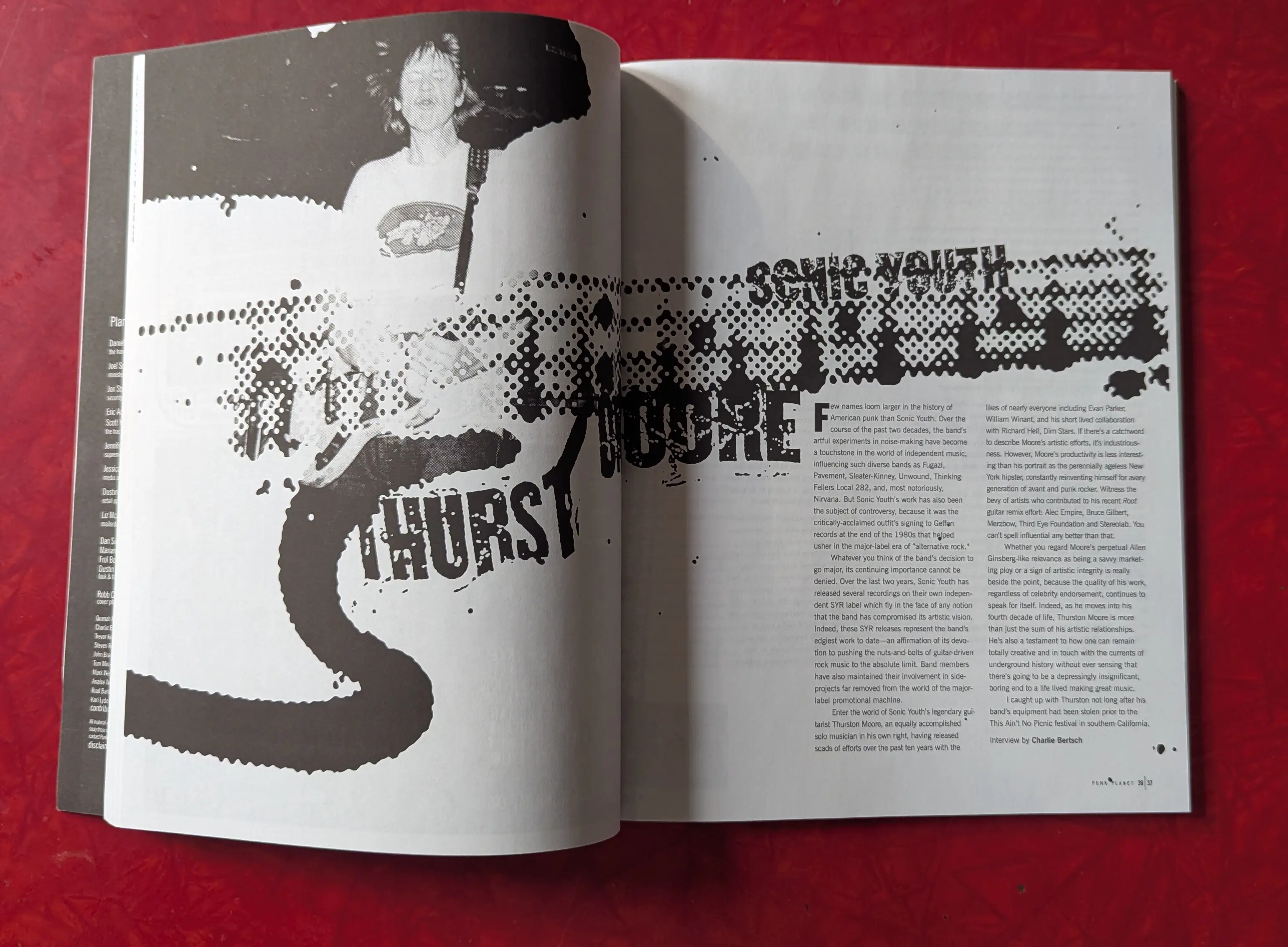
I love the way textures and photos overlap in this spread with Sonic Youth's Thurston Moore (PP34).
There are so many more beautiful layouts than I could include here. It was a new team, but it's amazing how well everything fit together pretty much immediately. Of course, it only gets better in Year Seven. See you next month.
Published October 30, 2024. |
Have new posts sent directly to your email by subscribing to the newsletter version of this blog. No charge, no spam, just good times.
Or you can always subscribe via RSS or follow me on Mastodon or Bluesky where new posts are automatically posted.
Foundational Texts: Raised by the Channel Five News Team
The third installment in the monthly Foundational Texts series looks at the iconic 1980s Channel 5 News Team, and the things they taught me when I was young and now that I am old.
Posted on Mar 31, 2026
Porous Barriers That Divide Then From Now
I came to Muncie, Indiana this week for this moment: March 24th, the night that George Dale's life changed forever. Even 104 years later, the reverberations of history stay close.
Posted on Mar 24, 2026
Record for tomorrow the stories that today's victors would prefer we forget
The second installment in the monthly Foundational Texts series looks at the message I took from The Goonies when I was ten and is still just as relevant today.
Posted on Mar 15, 2026