A Patch Three Pack
$20
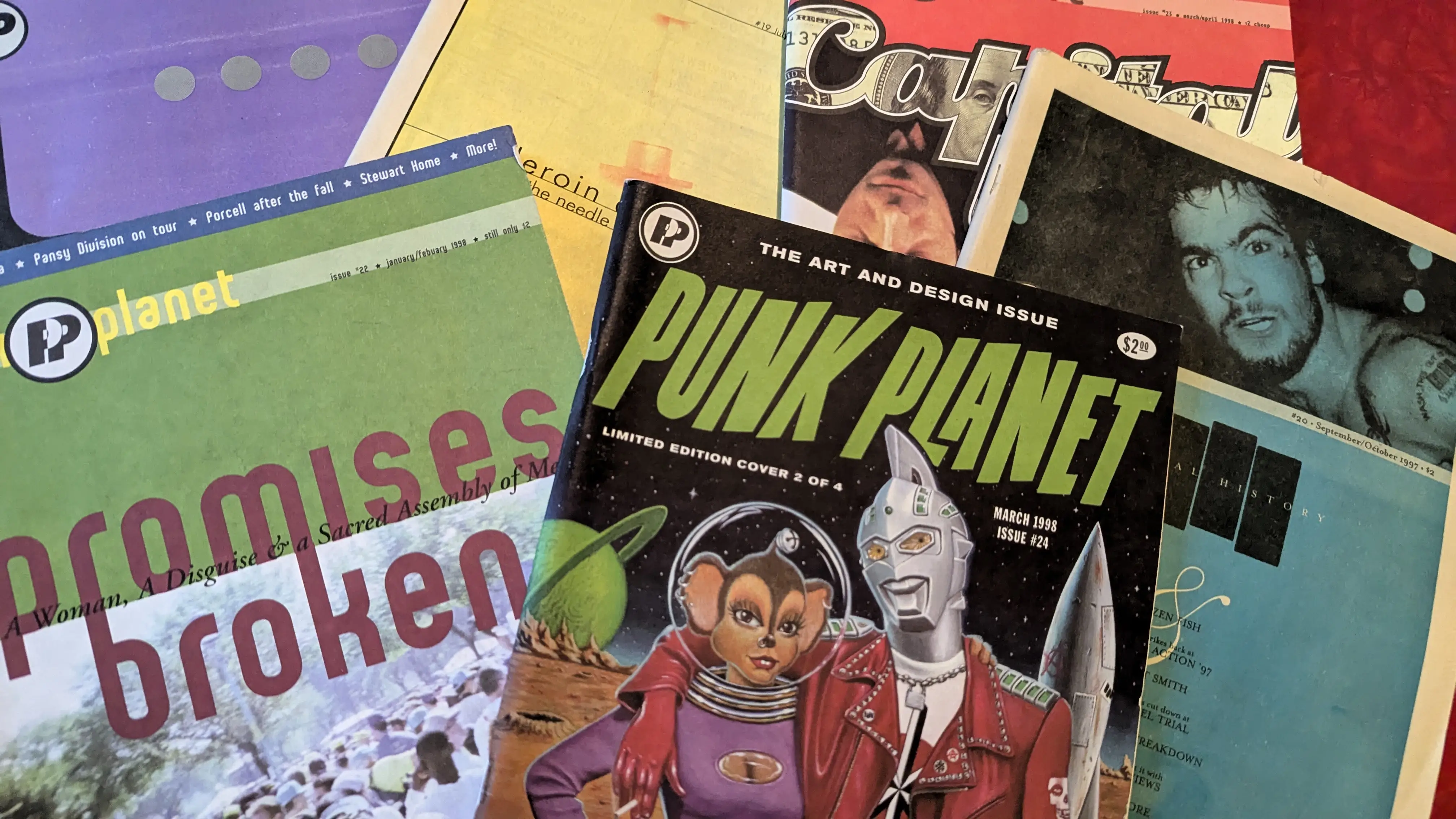
Punk Planet issues 19-24.
2024 marked 30 years since the start of Punk Planet, the magazine I ran for 13 years. To commemorate that milestone, I wrote 13 posts over 13 months, each one about a single year of the magazine. A year of learning, a year of trying, a year of making something impossible possible.
Read: Year One | Year Two | Year Three | Year Four | Year Five | Year Six | Year Seven | Year Eight | Year Nine | Year Ten | Year Eleven | Year Twelve | Year Thirteen
Unless I've forgotten something important (likely), there was no year with more changes for Punk Planet than the fourth year. As I wrote about at the end of the essay about Year Three, being picked up by Mordam Records for distribution changed everything for the magazine. Instead of hustling ourselves into stores, there was a dedicated staff of (incredibly great) folks to do that. Instead of boxing and shipping magazines across the country (and world), that was now Mordam's job. And instead of chasing down checks that would never arrive, they handled that (and they arrived). That was the fuel that drove massive change in Year Four.
In reading over all the introductions to the year's six issues, here's just some of the things that changed for the magazine (and me) in 1998:
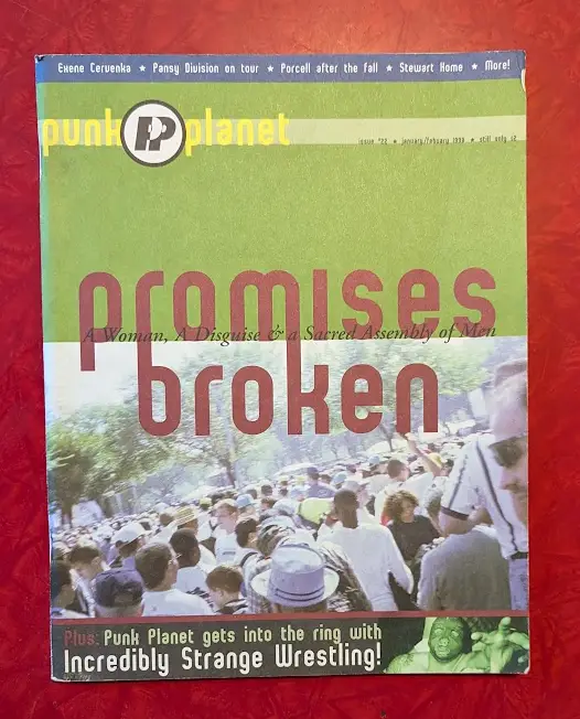
PP22, our first cardstock, full-color cover.
Year Four of Punk Planet was also when one of our most ambitious (and one of my very favorite) cover stories ran. In PP22's "Promises Broken: A woman, a disguise, and a sacred assembly of men," the writer Annalee Newitz (who has since gone on to become a best-selling author) traveled to Washington DC to attend, in disguise, the first national rally of the Promise Keepers, a men's-only evangelical Christian group.
"For about two weeks," Annalee wrote, "I had been practicing modulating my voice to make it lower. I tried different methods for constraining my breasts, finally settling on elastic athletic bandages and first aid tape. Standing in front of the mirror, I flattened my breasts over and over until I could do it quickly and efficiently. I knew in advance that I would have to bind myself in the train bathroom on the way to Washington, so I wanted to have my routine down pat."
Looking back on it 26 years later, I fully acknowledge now how completely dangerous this whole idea was, but back then Annalee was game and traveled from San Francisco all the way to DC to pull it off. We were all impossibly young and reckless. The piece Annalee wrote is stunning, scary, funny, and truly remarkable. It was one of the highpoints of the entire 13 year run of the magazine for me.
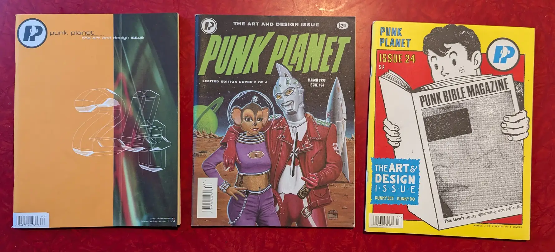
Three of the four covers for the Art & Design issue. Somehow the missing cover is the one I designed and don't have. These covers are by Volume One, House Industries, and Art Chantry.
Another came shortly after, with Punk Planet 24's Art & Design issue. The first of what would eventually become three theme issues dedicated entirely to underground art & design, looking at it today it almost makes me giddy just how alive it feels. Almost entirely a product of many late nights between Josh and me (the two of us conducted seven of the eight interviews in the issue), the issue's 164 pages are essentially our manifesto: that punk doesn't have to be just about music. That it can be art and photography and tattoos and prints and graphic design and so much more.
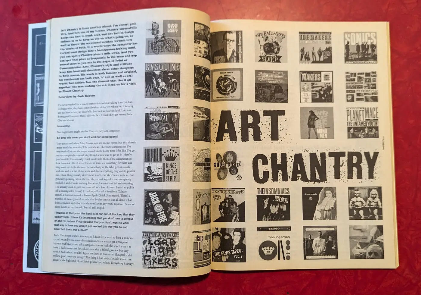
The opening spread for the Art Chantry interview.
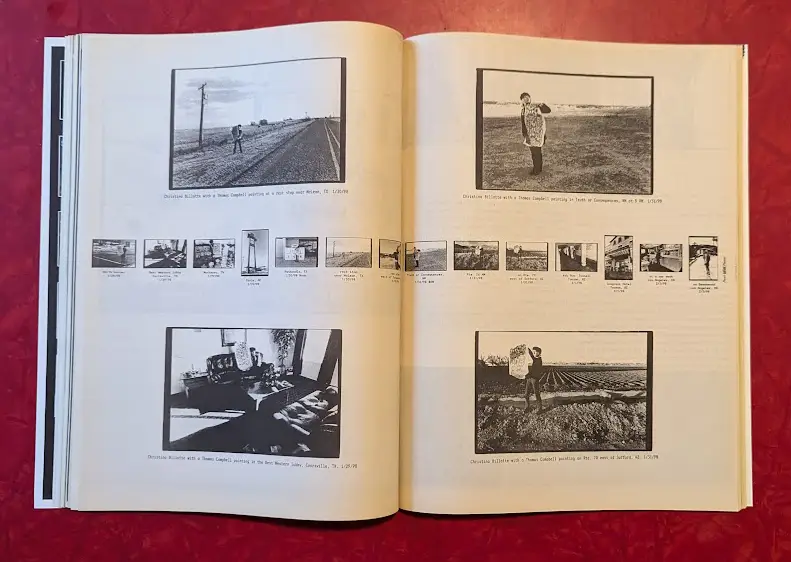
An interior spread from the Cynthia Connolly interview.
The issue covers some of the most influential artists in the underground, from Winston Smith, whose collages for the Dead Kennedys defined so much of punk's look in the 1980s, to DC punk documentarian Cynthia Connolly whose photo book Banned in DC was about the closest thing I had to a bible in high school. Garage graphic designer Art Chantry's work was up next to font designers House Industries. The fluorescent inks of poster artist Frank Kozik (reproduced poorly in black and white) contrasted with the moody photography of Chrissy Piper. To top it off, we commissioned four different covers and worked with our printer to divide the run evenly among them, making the issue itself a limited-edition piece of art.
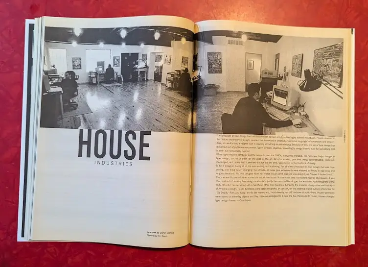
The opening spread for font designers House Industries.
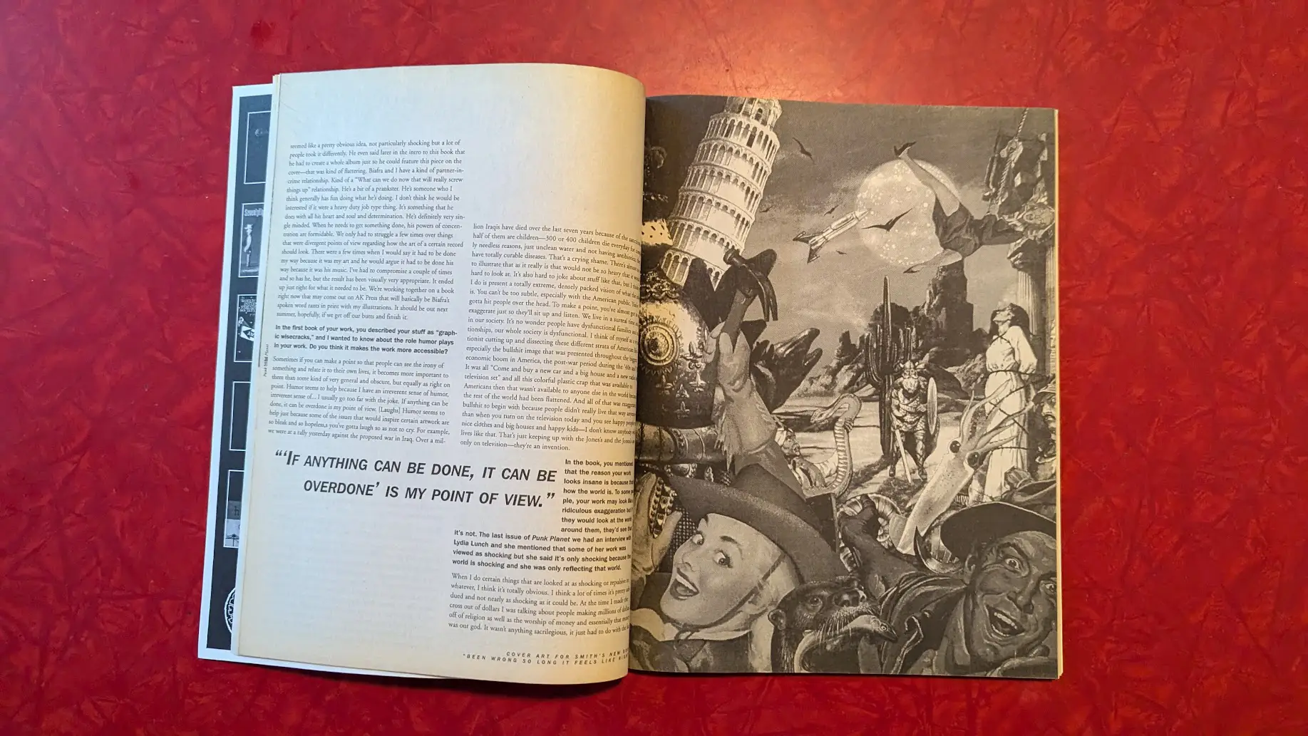
An interior spread from the Winston Smith interview.
The Art & Design issue was probably the defining moment for that era of Punk Planet. Something wholly different, completely surprising, and executed flawlessly. It redefined how people thought about what we did, and more importantly what punk could be. I still, do this day, meet people who cite the Art & Design issues as transformative to how they approached their own work. And it certainly transformed how we thought about Punk Planet, what we believed the magazine could accomplish, and how it could push the underground forward in new and exciting ways.
Ways that would start to manifest in wholly new approaches in Year Five, next month.
Published August 31, 2024. |
Have new posts sent directly to your email by subscribing to the newsletter version of this blog. No charge, no spam, just good times.
Or you can always subscribe via RSS or follow me on Mastodon or Bluesky where new posts are automatically posted.
Foundational Texts: Raised by the Channel Five News Team
The third installment in the monthly Foundational Texts series looks at the iconic 1980s Channel 5 News Team, and the things they taught me when I was young and now that I am old.
Posted on Mar 31, 2026
Porous Barriers That Divide Then From Now
I came to Muncie, Indiana this week for this moment: March 24th, the night that George Dale's life changed forever. Even 104 years later, the reverberations of history stay close.
Posted on Mar 24, 2026
Record for tomorrow the stories that today's victors would prefer we forget
The second installment in the monthly Foundational Texts series looks at the message I took from The Goonies when I was ten and is still just as relevant today.
Posted on Mar 15, 2026